The Ultimate Guide to Calming Colours in Interior Design: Turn Your Home into a Serene Sanctuary of Style & Balance

Photo by CreativaStudio
Ever walked into a home that instantly makes you exhale? That feeling isn’t accidental — it’s colour psychology at work. Whether you’re repainting a Queenslander, styling a Melbourne apartment, or refreshing a coastal retreat in Byron, learning how to choose calming colors in interior design can turn an ordinary space into a sanctuary.
What You’ll Learn in This Guide
This is a hands-on, practical guide designed to help you choose, test, and apply colours that genuinely improve your quality of life. You’ll discover:
- The psychology behind calming colour palettes — and how to avoid common mistakes.
- How to choose calming colours based on your home’s light, layout, and personal style.
- Room-by-room paint ideas — from serene living rooms to sleep-friendly bedrooms.
- Australian context tips, including how local light and materials affect colour perception.
- Expert design techniques for layering, lighting, and maintaining a cohesive flow between rooms.
Color Psychology & the Science of Calm

Photo by FollowTheFlow
What Is Colour Psychology & Why It Matters in Interior Design
When we talk about using calming colours in interior design, we’re really talking about colour psychology — the study of how different hues influence our emotions, thoughts, and even physiological responses.
Decades of research show that colour can affect our mood, heart rate, and energy levels. Hospitals, schools, and offices use these findings to create environments that promote focus, comfort, or relaxation.
The colours we choose for our walls, furnishings, and decor don’t just reflect light — they shape how we feel in our spaces every day. A cool blue-grey in a Bondi flat might evoke ocean tranquillity, while a warm greige in a Perth bungalow adds grounded comfort against harsh afternoon light.
The Science Behind Calming Colours
The perception of colour starts with light. Each hue has its own wavelength, and our brains interpret these wavelengths as emotional cues.
- Short wavelengths (blues and greens) calm the mind, lower blood pressure, and clear mental clutter — ideal for tranquil spaces.
- Long wavelengths (reds and oranges) energize and stimulate — great for active areas, but too intense for restful spaces.
- Muted, low-saturation tones reduce visual noise, offering the eye rest and promoting peace and balance.
Australian light, which tends to be stronger and warmer than European light, often makes colours appear brighter and more intense. That’s why cooler, dustier hues — sage, clay, soft blue-greys — often work better here than pure pastels or overly vivid shades.
Emotional & Physiological Responses by Colour Family
Each hue family interacts with our mood differently. Here’s how the most calming colour palettes tend to work in practice:
- Blues: Represent trust, serenity, and order. Soft dusty blues regulate heart rate and enhance focus—perfect for studies or bedrooms.
- Greens: Symbolize balance and renewal. Greens, like eucalyptus or olive, restore energy by mimicking nature—great for living areas or home offices.
- Neutrals: Warm greys, beige, and sand tones offer visual rest, supporting mindfulness and reducing fatigue.
- Earth Tones: Ochre, terracotta, and muted clay create a grounded, stable feel, reflecting the Australian landscape.
- Lavender & Muted Purples: Nurturing, introspective shades ideal for personal or creative spaces.
When Calming Colours Don’t Feel Calm
Sometimes, a supposedly relaxing colour ends up feeling off. That’s usually due to:
- Lighting mismatch: A soft grey can look blue under cool LEDs or muddy under warm halogens.
- Undertone clash: Warm and cool undertones fighting each other across walls, floors, and furniture.
- Overuse: Too much of one tone can make a space flat or gloomy rather than soothing.
- Context conflict: A calming blue in a coastal setting might feel clinical in a shaded, windowless room.
The trick is balance — combining calming colours with natural textures, warm lighting, and gentle contrast.
How Surroundings & Context Influence Colour Psychology
Colour rarely exists in isolation. Your flooring, ceiling, furniture, and even outdoor landscape play a role in how a shade feels.
- Light direction: North-facing rooms in Australia get cooler light — ideal for warmer tones like soft beige, clay, or blush. South-facing rooms, flooded with warm light, suit cooler hues like blue-grey or sage.
- Surface texture: Matte finishes feel quieter and more restful than glossy ones, which reflect more light and movement.
- Room function: A lounge may call for balance and connection, while a bedroom demands tranquillity and enclosure.
- Personal association: Colour memories are powerful — a green reminiscent of school walls might agitate rather than soothe.
Also Read:How to Choose Tapware for Kitchen & Bathroom | Smart, Stylish & Sustainable Living
Step-by-Step Guide: How to Choose Calming Colours with Confidence

Photo by imaginima
Step 1. Start with Intention: What Do You Want the Space to Feel Like?
Ask yourself:
- Should this space feel open and refreshing, like sea air drifting through the windows?
- Or would you prefer something soft and cocooning, perfect for unwinding at day’s end?
- Maybe you need steady focus and balance — especially in a workspace or study area?
Once you define the feeling, you can narrow down to the right family of calming colours:
| Desired Mood | Ideal Colour Family | Emotional Effect |
| Tranquil & Balanced | Blue-greens, dusty aquas, misty greys | Encourages rest and reflection |
| Warm & Grounded | Muted beige, warm neutrals, soft terracottas | Creates a sense of comfort and security |
| Light & Airy | Soft whites, pale greys, gentle sage | Enhances space and light flow |
| Restful & Enclosed | Deep muted teals, charcoal-greens, taupe | Brings intimacy and calm focus |
Step 2. Colour Harmony: The Art of Quiet Balance
Calm interiors rely less on bold contrast and more on harmony. The trick is to use colours that relate naturally, much like hues found together in nature — sea, sand, leaf, sky, stone.
Here are a few dependable approaches:
- Analogous palettes: Choose colours that sit next to each other on the colour wheel — for instance, green, blue-green, and blue. The transitions feel seamless and gentle.
- Monochromatic palettes: Work within one hue, using lighter and darker variations. This creates depth without visual tension.
- Balanced contrast: Introduce a soft complementary tone (such as a muted blush against a gentle sage) to add dimension while keeping serenity intact.
Step 3. Understanding Undertones: The Key to True Harmony
Even the most neutral shades carry a hidden undertone — a whisper of warmth or coolness that determines whether your space feels inviting or slightly “off.”
How to identify undertones:
- Compare your paint sample against a sheet of true white paper — the hidden hue will reveal itself (yellow, pink, green, or blue).
- Observe it in both natural daylight and evening light — undertones can shift with temperature.
- Match undertones across materials: warm woods and stone like oak or travertine pair best with warm undertones; cool materials like concrete or marble favour cooler hues.
Examples:
- Warm neutrals (with beige, clay, or peach undertones) add comfort and softness.
- Cool neutrals (with blue or green undertones) introduce a fresh, crisp calm.
- Greige tones — a blend of grey and beige — sit perfectly in the middle, offering adaptable tranquillity.
Pro Tip: If your space includes both warm and cool finishes, use a “bridge” colour — like a muted olive or stony taupe — to tie them together.
Step 4. How Light and Finish Transform Colour
Light changes everything. A colour that feels soothing in the morning might look sharp under artificial light at night. That’s why every calming palette should be tested in context.
Steps to test effectively:
- Paint a large patch (about one square metre) directly on your wall.
- Observe it at different times — early morning, midday, dusk, and under your evening lighting.
- Take note of how it feels, not just how it looks.
Lighting direction matters:
- North-facing rooms: receive cooler, subdued light — warmer tones add balance.
- South-facing rooms: glow with warmer light — cooler hues like blue-green or misty grey can feel refreshing.
- East-facing: morning light enhances clarity; works well with soft greens and neutrals.
- West-facing: golden afternoon light warms colours — opt for dusty, not bright, hues.
Finish also impacts calmness:
- Matte finishes absorb light and reduce glare — ideal for restful spaces.
- Low-sheen or eggshell offers a touch of durability without harsh reflections.
- Gloss finishes reflect too much light — best avoided in calming zones.
Also Read: 40+ Bathroom Lighting Ideas: Expert Guide for Stylish & Functional Bathroom Illumination
Step 5. Layering Colour and Texture for Depth
Think in three levels of depth:
- Base tone: the wall colour — soft and subdued.
- Secondary tone: found in large furnishings or flooring — slightly deeper or lighter.
- Accent tone: introduced subtly through textiles, artwork, or decor.
To prevent flatness, mix textures: matte paint with woven fabrics, timber, linen, stone, or ceramic. These materials diffuse light differently, creating gentle variation that relaxes the eye.
Pro Tip: Plan your home’s palette as a whole. Lay all chosen colours side-by-side on one board to ensure a smooth, harmonious flow from room to room.
Also Read: [GUIDE] Dopamine Decor & Interior Design Tips to Boost Your Mood
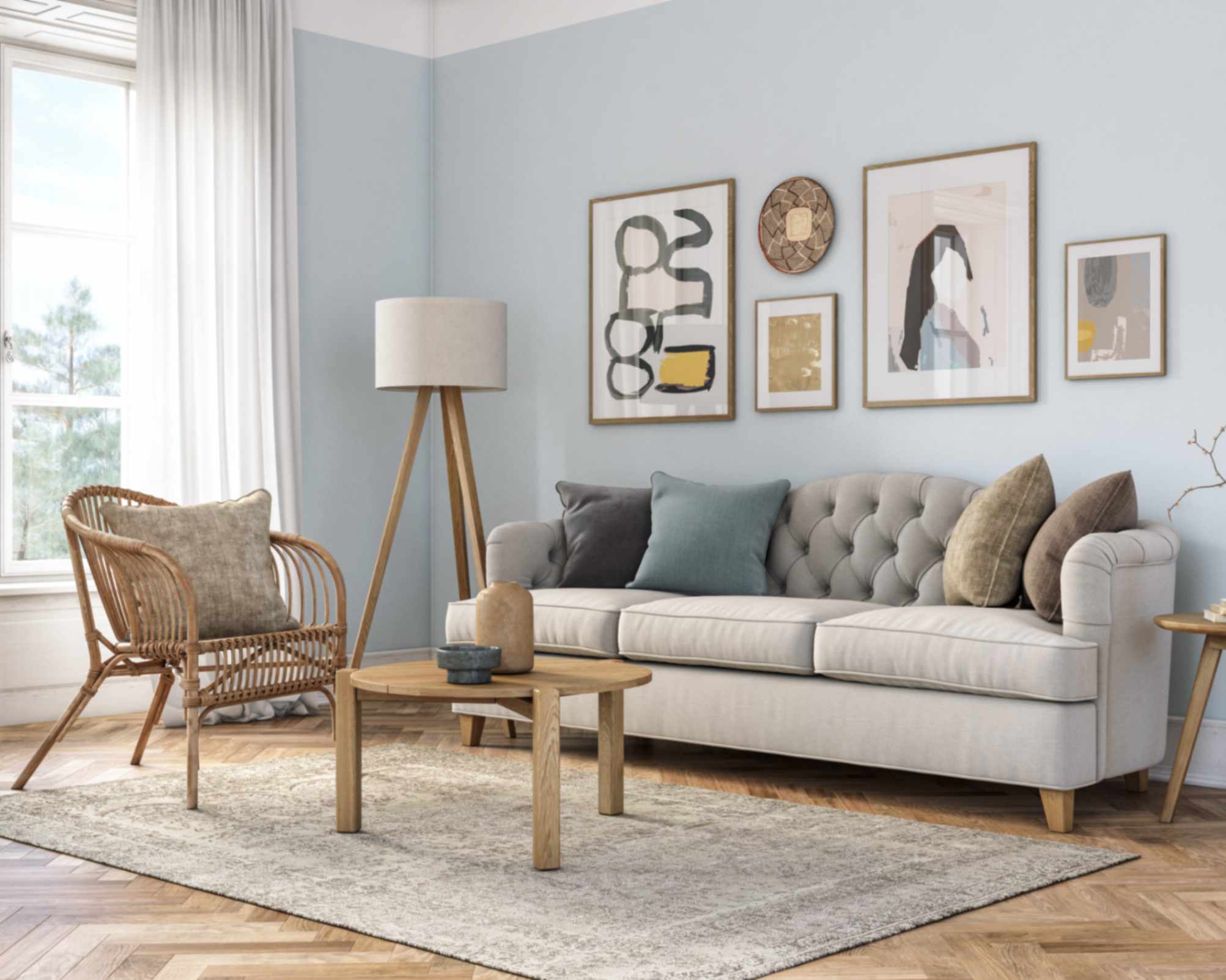
Calming Paint Colours & Palettes for the Living Room

The living room is where calm and connection meet. It sets the emotional tone for the home — a place to gather, unwind, and reset. The most effective calming colors in interior design for living areas act as a backdrop that grounds activity rather than competing with it.
Best Colour Families for Calm Living Rooms
Each colour family influences mood differently. Choose according to light, layout, and lifestyle.
- Blue-Greys and Seafoam Greens: Evoke openness and cool balance; ideal for bright or warm climates.
- Muted Greens (sage, moss, eucalyptus): Connect to nature; soften timber and plant-filled rooms.
- Warm Neutrals (beige, greige, stone): Create quiet warmth and pair well with most materials.
- Earthy Tones (clay, terracotta, taupe): Add grounded stability and pair naturally with textures.
- Deep Muted Shades (charcoal-green, smoke-blue, mushroom): Introduce depth and calm in large rooms.
Pro Tip: Choose soft, muted tones over bright hues. Low-saturation colours feel timeless and restful under all light conditions.
Simple Living Room Palette Ideas
Use these examples as a starting point for your own palette:
- Coastal Calm: Misty grey walls, pale sand upholstery, soft white trims.
- Modern Organic: Sage or soft green walls, neutral sofa, woven and timber accents.
- Earth Sanctuary: Clay or taupe walls, terracotta accessories, olive or tan details.
- Evening Retreat: Deep blue-green feature wall, lighter surrounds, warm metals.
Keep proportions simple — 60% base colour, 30% secondary tone, 10% accent.
Living Room Accent & Contrast Strategies
Calm design doesn’t mean flat. Small contrasts add life without disrupting flow.
- Accent walls: One tone darker or lighter than main colour.
- Architectural highlights: Use subtle variation on trims or built-ins.
- Soft contrast accessories: Add low-saturation cushions, throws, or artwork.
- Metallic or textural accents: Brushed finishes add quiet sophistication.
Creating Flow in Open Living Rooms
For connected rooms, aim for consistency and gentle transitions:
- Keep a single undertone (warm or cool) across spaces.
- Adjust lightness rather than hue between rooms.
- Use neutral hallways or link colours to bridge transitions.
- Maintain flooring consistency to support colour flow.
Pro Tip: Stand at your entryway and look through the house — your palette should feel like one continuous story.
Lighting & Material Pairings for Living Rooms
Living room lighting and texture complete the calm.
- Lighting: Use warm, layered sources (lamps, wall lights) and avoid harsh overhead glare.
- Materials: Pair cool hues with warm textures (linen, wood); pair warm hues with crisp accents (ceramic, light textiles).
- Natural elements: Plants or stone bring organic calm and subtle contrast.
Also Read:[GUIDE] Biophilic Design: Nature-Inspired Architecture That Elevates Mood, Health & Sustainability
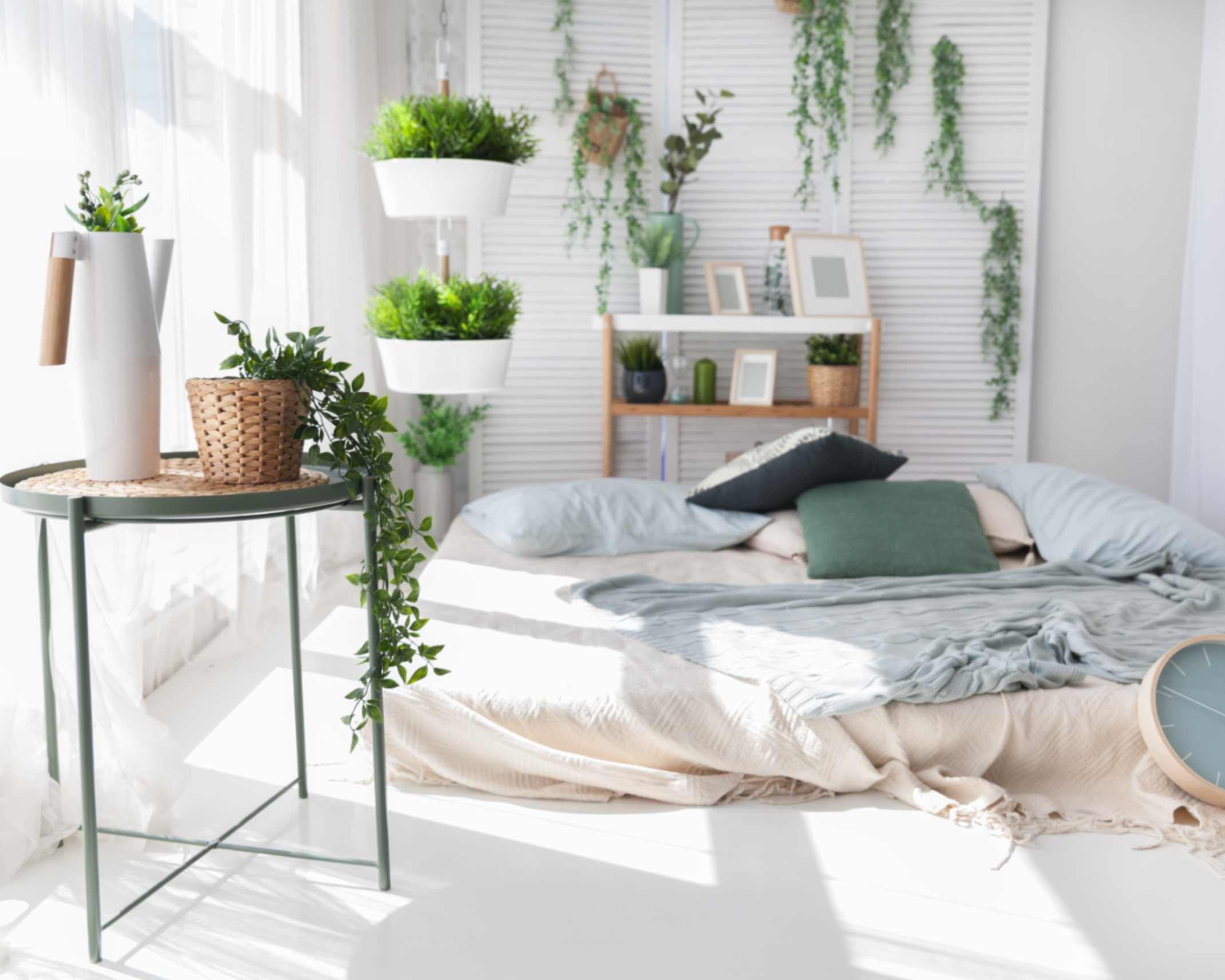
Calming Colours & Palettes for the Bedroom

The bedroom is where the body and mind reset. Colours here influence sleep quality, relaxation, and emotional balance. Calming palettes use muted, low-saturation hues that ease the senses. Bright or high-contrast colours can subtly raise alertness and make it harder to unwind.
Best Calming Colour Families
- Soft Whites & Creams: Light and airy, ideal for smaller or dim rooms. Prevent a sterile look by layering with natural fabrics and texture.
- Muted Greens (sage, moss, olive): Balanced and restorative, these hues bring a sense of nature indoors. Pair with wood or woven textures.
- Cool Blues (sky, dusty teal, navy-grey): Help regulate mood and promote calm, especially in warm climates or bright spaces.
- Soft Greys & Greige (grey-beige blends): Neutral and adaptable. Add warmth with natural fibre bedding or timber accents.
- Earthy Neutrals (clay, sand, mushroom): Grounding and warm. Work well in larger rooms or spaces with strong natural light.
Avoid vivid reds, yellows, or blacks — they’re stimulating and counter to restful design.
Sample Bedroom Palettes
- Morning Light: Off-white walls, pale sage accents, linen bedding.
- Evening Cocoon: Deep blue-grey walls, soft grey bed linen, warm lighting.
- Nature Retreat: Moss green walls, sand curtains, timber furniture.
- Minimal Calm: Pale grey base, white bedding, a single muted accent tone.
- Soft Neutral Romance: Warm cream base, blush textiles, brushed metal accents.
Design Tip: Always check colours under your evening lighting; tones shift at night.
Walls, Ceilings & Trim Ideas for Calm Bedrooms
- Walls: Main calming colour in matte or low-sheen finish.
- Ceilings: Slightly lighter tint of the wall colour softens contrast.
- Trim: Use the same hue one or two tones lighter or darker for cohesion.
- Feature Wall: Best behind the bedhead to define space without overstimulating.
Pro Tip: If using dark tones, balance them with pale bedding and warm light.
Texture & Materials for Peaceful Bedrooms
Calm is enhanced by texture. Combine:
- Natural fibres — linen, wool, cotton.
- Matte surfaces and woven details.
- Soft rugs for warmth underfoot.
Avoid shiny finishes and busy patterns. Choose brushed metals over polished ones.
Lighting Tips for Calm & Sleep
- Use warm, low-intensity lighting (around 2700K) in bedrooms. (Read more here: Bedroom Lighting Ideas to Set a Serene Mood)
- Avoid bright or cool-white bulbs at night. Layer lighting for flexibility — bedside lamps, wall sconces, and dimmers help maintain a restful tone.
Pro Tip: Warm light keeps colours true and helps the body prepare for sleep.
Also Read: How to Add Texture to Your Home: The Ultimate Guide
Expanding Calm: Applying Calming Colours Beyond Living & Sleeping
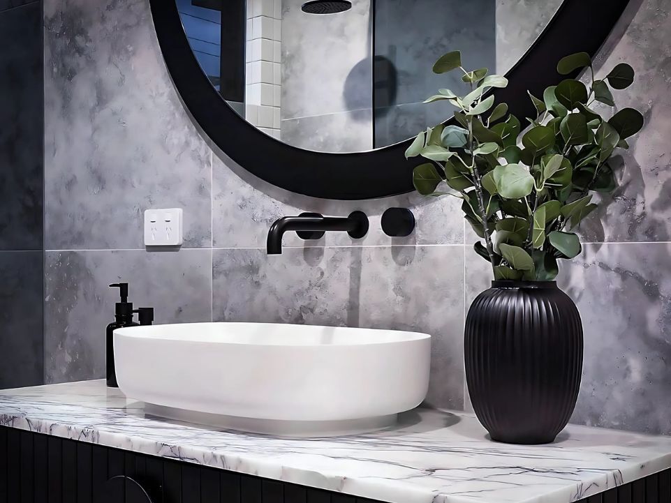
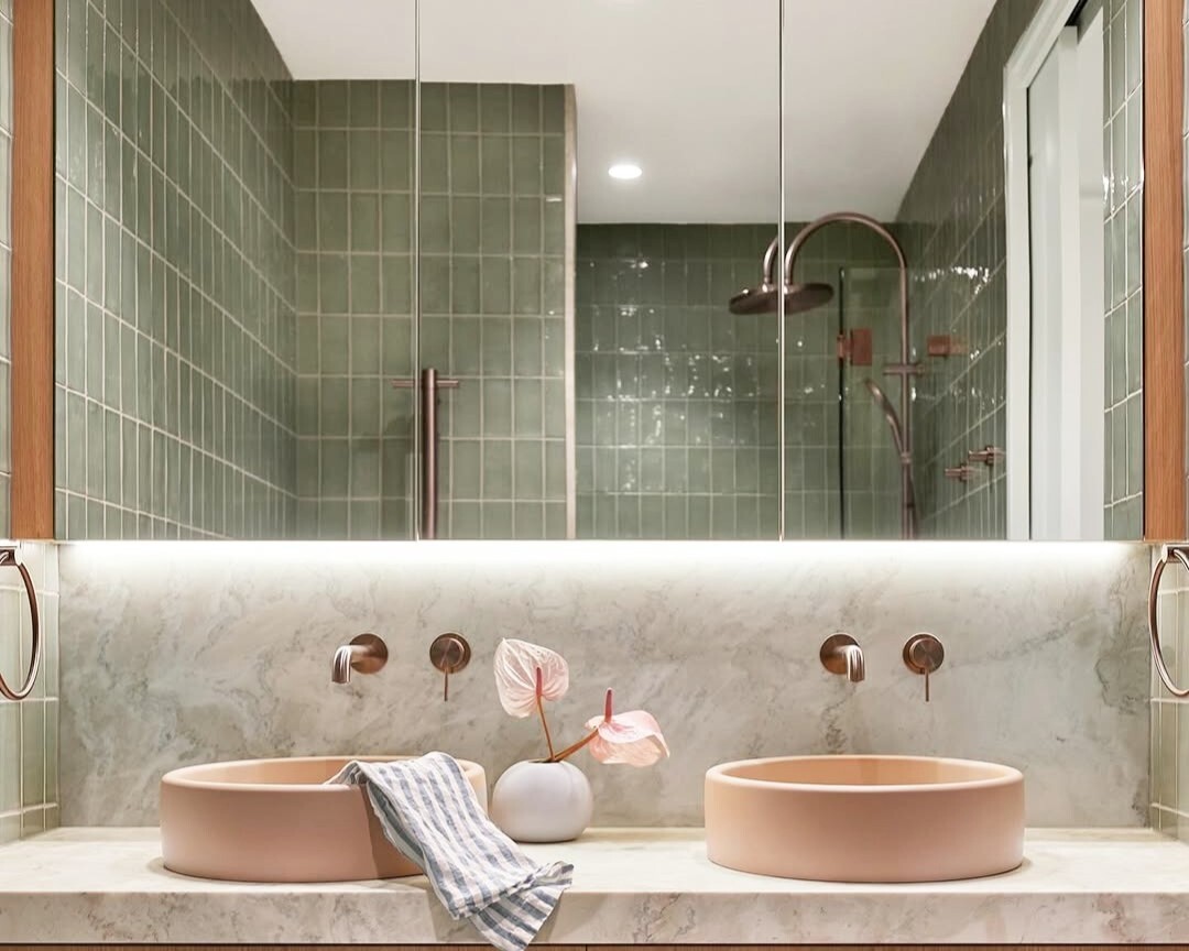
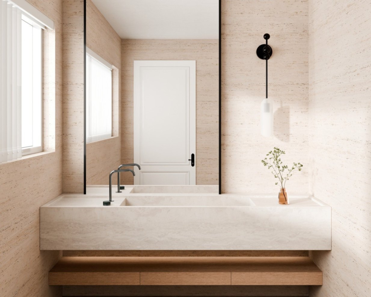
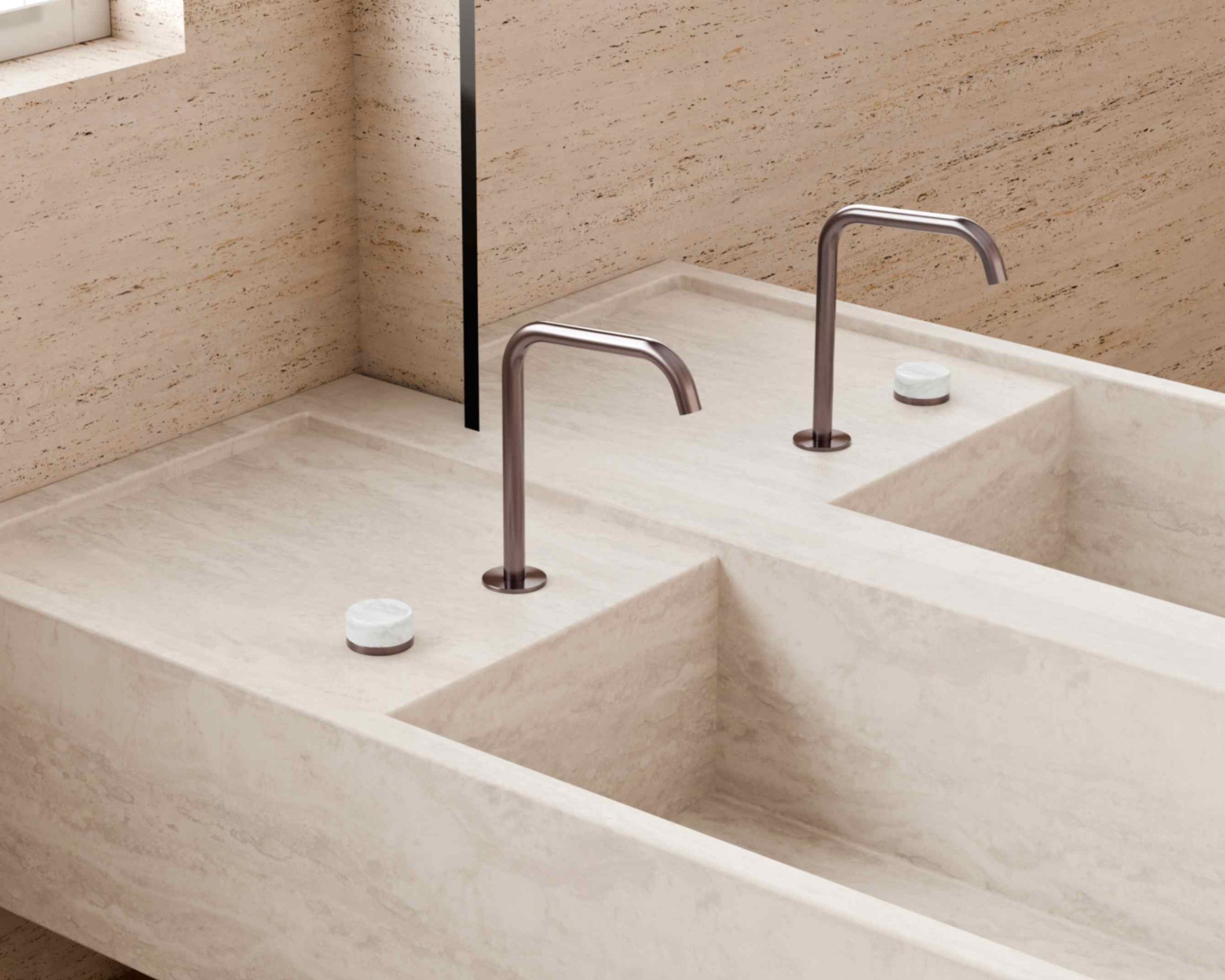
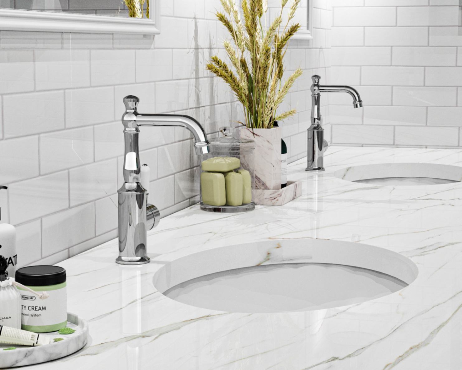
Bathrooms & Powder Rooms: Calming Colors for Spa-Like Simplicity

Bathrooms are often where we begin and end the day — the perfect place to apply refreshing yet tranquil colours.
Best hues:
- Pale blue-greys, misty greens, or soft whites for freshness and light reflection.
- Warm neutral tones (like sand or almond) for spa-like comfort.
- Gentle green-grey tones for balance and natural association.
Pro Tip: Introduce natural light reflection softly — frosted glass, mirrors with rounded edges, and muted metallics keep the space serene rather than clinical.
Also Read: 35 Green Bathroom Ideas & Designs For All Styles: Complete Guide
Home Office or Study: Focus Without Fatigue
When designing a work zone, the goal isn’t stimulation — it’s calm concentration. Colours here should encourage focus while reducing mental clutter.
Ideal colour families:
- Muted blue-greens and mid-tone greys promote clarity and composure.
- Earthy neutrals or taupe tones ground the mind and balance digital screen glare.
- Soft olive or green-grey walls restore equilibrium, particularly in creative fields.
Expert Tip: In home offices, the colour surrounding your direct line of sight (the wall behind your desk) has the biggest emotional impact. Choose your calmest hue for that surface
Also Read:[GUIDE] 29 Home Library Ideas: Design a Beautiful, Functional Reading Sanctuary
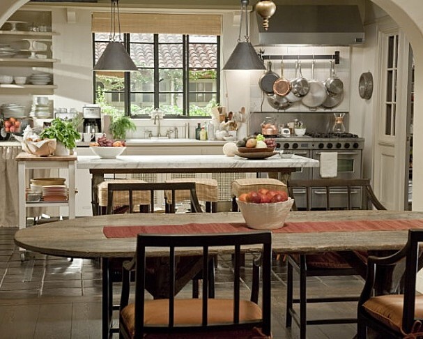
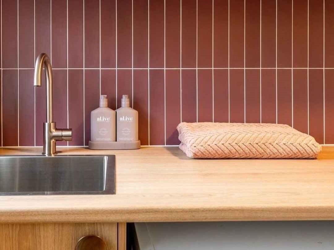
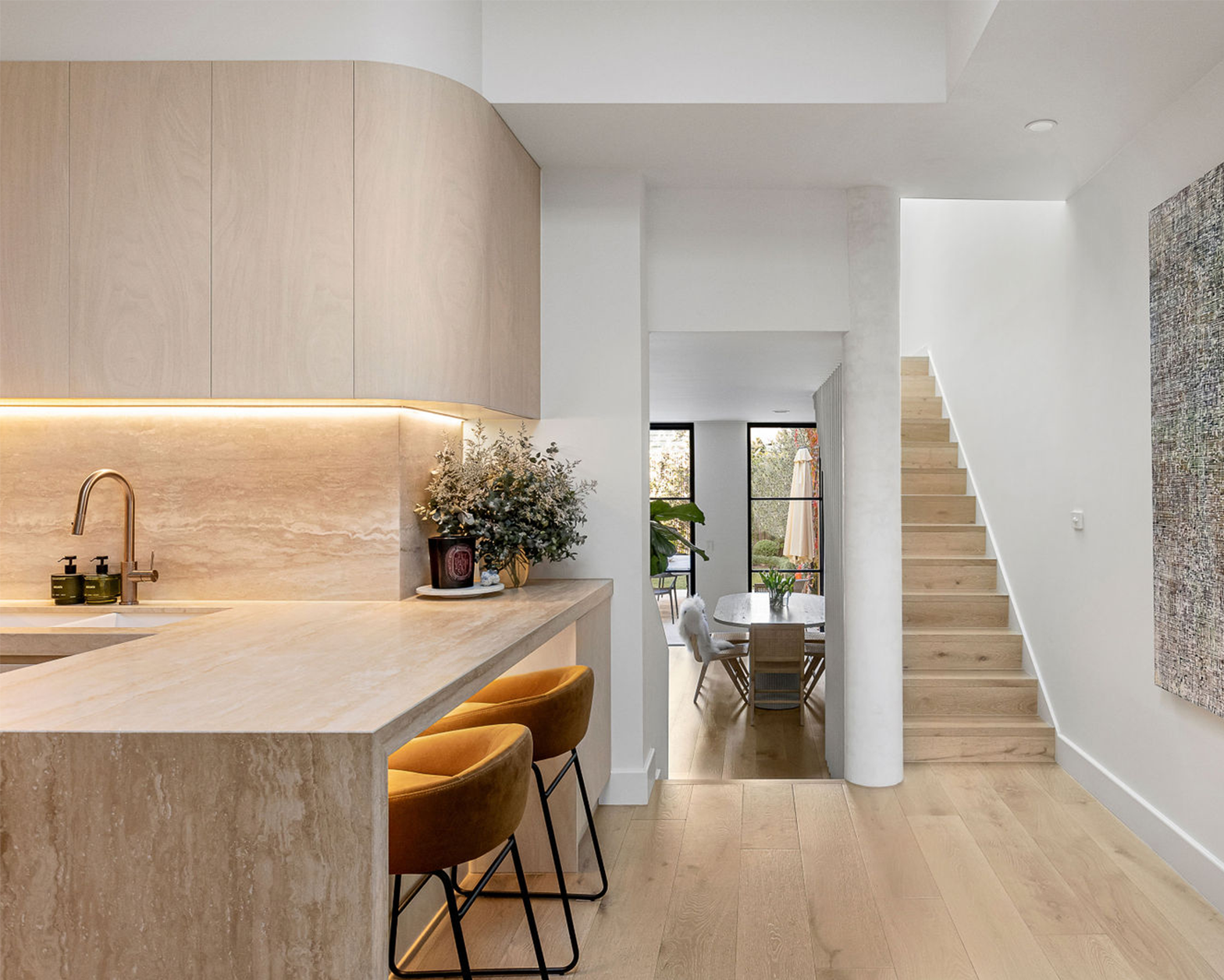
Kitchens & Dining Spaces: Calming Colors for Balanced Energy

Kitchens and dining areas need calm — but not sleepiness. They benefit from grounded, natural tones that feel warm and inviting while maintaining visual clarity.
Calming colour families:
- Warm greys, beige, or cream for cabinetry and walls.
- Sage greens or muted blue-greys for balance and freshness.
- Clay or sand tones for a rustic, natural atmosphere.
Expert Insight: The kitchen is often the brightest room in the house. To keep calm energy, balance bright daylight with gentle tonal depth — mid-tones on cabinets or walls will help soften the overall feel.
Also Read: 35+ Coastal Kitchen Ideas That Bring the Beach to Your Home
Bringing the Whole Home Together
Whether your home is coastal, urban, or countryside, the unifying thread should be comfort and consistency.
To achieve whole-home calm:
- Choose an undertone family (warm or cool) and stick with it.
- Use gradual tonal shifts between rooms — lighter where natural light is strong, deeper in enclosed spaces.
Also Read:
- How to Confidently Mix Kitchen Knobs, Pulls & Fixtures for a Custom Look
- Mixing Metals Like a Designer: The No-Fail Formula for a Luxe, Layered Look
- Coffered Ceilings: Modern Designs, Benefits, Costs & DIY Guide
- Raked Ceilings: Benefits, Design Ideas & Practical Considerations
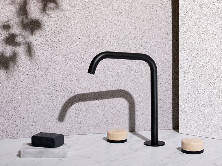
Next Steps: Elevate Your Calm Aesthetic with Nero Tapware

Create Calming Bathrooms, Kitchens, Powder Rooms with Nero Tapware
Once your home’s colour palette and atmosphere are aligned, the next layer of calm comes from touch — the sensory experience of materials you use every day. This is where Nero Tapware beautifully completes the picture.
Why Fixtures Define Calm
True serenity is both visual and tactile. Every surface you touch — a smooth kitchen mixer or cool bathroom tap — shapes your sense of ease. Nero Tapware transforms these everyday moments into sensory design, with minimalist forms, soft curves, and finishes crafted for touch. Each piece is functional art that enhances tranquillity through craftsmanship.
Designing Calm, the Australian Way
Blending indoor and outdoor living, Nero’s tapware brings natural elegance to bathrooms and kitchens alike. Warm metallics complement neutral palettes, while matte and brushed finishes contrast beautifully with misty blues or stone tones — subtly reflecting light to create depth and calm.
Pro Tip: Match your tapware finish with lighting and accessories for cohesive, spa-like serenity. The eye reads harmony through repetition — that’s the essence of calm.
Ready to Elevate Your Space? Explore Nero Tapware — timeless designs that complete your calming interiors with minimalist beauty and effortless balance. Start with some of our popular collections: Serenity, Zen, Mecca, Opal, and Bianca.